
Top 5 Features in Soofa Atlas
Would you like to know how much usage your Soofa Bench in a park is getting compared to your Soofa Bench at a bus stop nearby? When Soofa Benches are connected to the internet, they share data on how many people charge and for how long. This data is then visualized in Atlas where you can view it online and download it. Below is an overview of the top 5 features for monitoring bench usage that Soofa Atlas offers, as told to us by our clients.
Bench Leaderboard
Map of Installed Benches
Weekly Usage Snapshots
Most Popular Times Analysis
All Time Charging Statistics
Bench Leaderboard
By far the most popular feature among our clients, the leaderboard lets you see how all of your benches compare against each other in terms of overall usage. The example below is from Cambridge, MA. The data shown represent about a one month collection period from late February 2016 through March 2016. The bench leaderboard can compare bench usage by both duration (total number of hours charged) as well as by charging sessions (total number of individual devices that have been charged). The best part? You get to name the benches in your network! We've even seen different departments in cities, for example, have competitions over whose bench gets used the most.

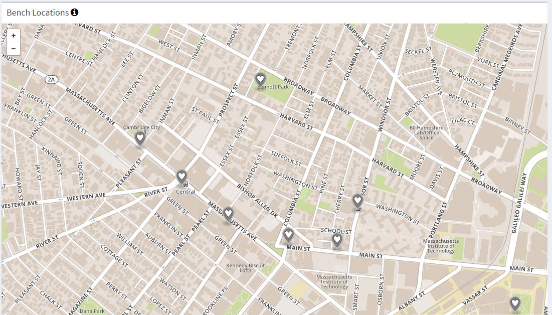
Map of Installed Benches
A great way for everyone on your team to know exactly where your smart infrastructure is installed across your city, campus, or neighborhood. This makes maintenance a breeze since every bench is located precisely with latitude and longitude coordinates. Soofa Atlas' interactive map also shows bench charging in real time, lighting up each bench as a charge is occurring. Each bench, as indicated by the white and gray heart on the map, can be be clicked on directly, pulling up a snapshot of the last week's actual usage versus the average usage.
Weekly Usage Snapshots
You can click on any smart bench in your network in the map view above to see how it has been used over the last week in comparison to average usage. This is a great tool to quickly draw insights on whether an event you hosted on a specific day in the past week encouraged more usage or if the week as a whole saw greater than average usage. Was it a holiday week, a popular travel time which brought more people out and about, a stretch of beautiful weather that generated more engagement with your bench network? These questions can be asked and answered by looking at the weekly snapshot. For example, in the graph below, Monday was far busier than the average because it was Marathon Monday in the City of Boston.

Most Popular Times Analysis
How is your bench being used on different days of the week? With the most popular times analysis feature in Atlas, you can get the answer to this question. This feature lets you see the average usage of your benches for each day of the week. Draw insights into when your benches are most popular and how this changes by the day of the week and the location of the bench. The examples below are from a Soofa Bench at a bus stop. The insights don't stop there; imagine seeing how your benches in parks are used differently during the week versus the weekend, or how your benches in public squares are used during the lunch hour versus the evening dinner rush.
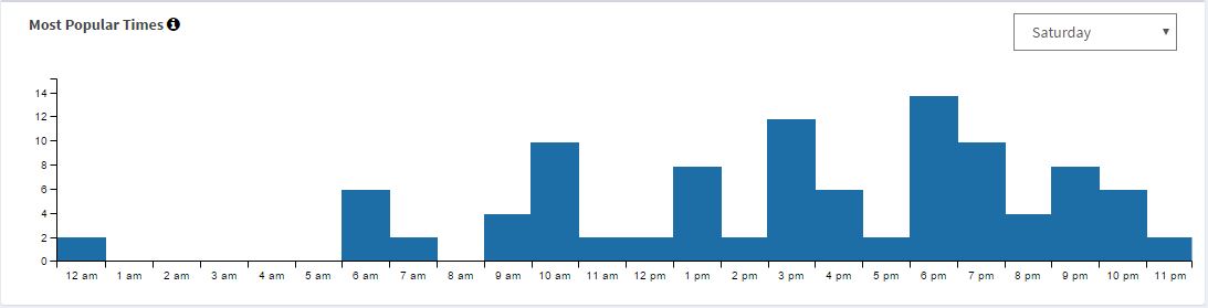
The graph above shows average usage data from a bench located at a bus stop in Harvard Square, Cambridge, MA on a Saturday. You can see there are a few early rising commuters as evidenced by the 6-7AM usage, but primarily this bus stop is getting used much more by younger college students going out and about in the late afternoon and evening.

Here's the same bus stop in Harvard Square on an average Monday. You can see the usage pattern is far different. On an average work day the bench is used much more frequently during rush hour on the way home as everyone's phones have drained battery throughout the workday, then again at 9PM as people are heading home from post-work festivities.
All Time Charging Statistics
Want to know how much charge you've provided the people in your city, campus, or community? We've got you covered. When you log into Soofa Atlas we give you a snapshot of how active your Soofa Bench network is. The snapshot featured below is from the City of Cambridge, MA. The City has 18 Soofa Smart Benches. The data is from just over one month of collection from late February through March 2016. Just imagine how busy these Cambridge benches will be when spring and summer finally make their way to Massachusetts!

Do you want to learn more about how you can upgrade your Soofa Benches to connect to the Soofa Atlas Cloud? Valuable insights are waiting! Just send Ed an email and let him know that you'd like to know more about Atlas. He will set you up with a live demonstration and walk you through the upgrade process.